
Reading a Live Report (Sales Overview Example)
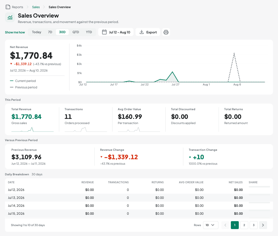
Sales Overview (Reports > Sales > Sales Overview) is the most complete report and a good example of what a fully built report looks like:
- Start with the headline figure at the top left: Net Revenue for the period, with the change against the previous period underneath it (an up or down triangle, the amount, and the percentage). The dates the figure covers are printed below that.
- To its right is the revenue trend, plotting this period as a solid line and the previous period as a dashed one — the small legend beside the headline says which is which. If there isn't enough daily data to draw a trend, it falls back to a simple two-bar comparison instead.
- Under This Period, one row of five figures: Total Revenue, Transactions, Avg Order Value, Total Discounted, and Total Returns. Each carries a small sparkline showing how it moved day by day. A figure that does not exist for the period (for example an average order value with no transactions) shows a dash, not a zero.
- Under Versus Previous Period, three figures: Previous Revenue, Revenue Change, and Transaction Change — green with an up mark for an increase, red with a down mark for a decrease, and muted when nothing moved.
- Daily Breakdown is the table underneath, one row per day (Date, Revenue, Transactions, Returns, Avg Order Value, Net Sales) plus a Share bar showing how big that day was against the busiest day on the page. It's sortable by column and paginated at the bottom (10/25/50/100 rows per page).
Most other reports follow the same shape — figures and/or a chart at the top, a detail table underneath — just with different columns for their subject (inventory levels, purchase orders, audit events, and so on).